Good. I now have more than enough data to write a comprehensive, well-cited blog post. Let me compose the article.
Your Mailchimp email marketing design guide starts here. Good design isn't decoration. It's the difference between a campaign that converts and one that gets deleted before the second scroll.
Email marketing campaigns have an average ROI of 36 times, meaning businesses earn $36 for every dollar they spend. But that return depends entirely on whether your emails get opened, read, and acted on. The design choices you make inside Mailchimp determine all three.
This guide covers every layer of the Mailchimp email marketing design guide: from layout dimensions and typography to CTA buttons, image ratios, mobile optimization, and Mailchimp's AI design tools. Whether you're building from a template or coding custom HTML, these are the decisions that move metrics.
Key Takeaways
- Between 50 and 60% of email opens come from mobile devices in 2024, making mobile-first design a baseline requirement, not an optional upgrade.
- Mailchimp templates are designed to be no greater than 600px wide to fit the display capabilities of most email clients.
- Good email design is about visual hierarchy: readers should know within seconds what to do, with one primary headline, clear spacing, readable fonts, obvious CTA placement, and a mobile-friendly layout.
- The 60/40 rule (60% text, 40% images) is the most widely accepted image-to-text guideline, as SpamAssassin, one of the most commonly used spam-detection systems, recognizes it as a general threshold.
- Mailchimp's Brand Kit lets you save and update your logos, fonts, colors, and brand personality so AI tools can quickly generate on-brand graphics and layouts for your emails and automation flows.
1. Start Every Design with a Clear Goal
Before you open a template and start designing, take a step back and define what you want to accomplish. Are you driving traffic to a blog post? Encouraging recipients to shop your latest collection? Promoting an event? Your goal should influence every design decision you make, from the email header to the final call to action. When your design aligns with a single, focused objective, your email marketing message will be clearer and more compelling.
This is where most Mailchimp campaigns go wrong. Trying to say everything in one email is usually the fastest way to reduce clicks.
Before building anything, answer three questions:
- What is the single action I want the reader to take?
- Who exactly is receiving this email?
- What does success look like for this send?
The rest of your design decisions, including layout, images, and copy length, should serve those answers. Nothing else.
2. Layout Fundamentals: Width, Structure, and Column Choice
Your HTML email's layout should be anywhere from 600 to 800 pixels in width, since many email clients provide a preview window that isn't very wide. In practice, Mailchimp templates are designed to be no greater than 600px wide to fit the display capabilities of most email clients, and this is the safest default for maximum rendering compatibility.
The layout you choose sets the foundation for your entire email. A single-column layout works well for mobile device viewing and keeps the design simple, while a multi-column design can showcase multiple products or features at once.
Here's how to choose between them:
- Single-column: Best for newsletters, announcements, onboarding emails, and any content where reading order matters. Renders cleanly on all screen sizes.
- Multi-column: Works well for product grids, feature comparisons, or curated content roundups. Requires testing on mobile since multi-column designs typically break across the small screens of mobile devices.
Information hierarchy is very important. Event details and critical content should always be up top and prominent in size. If present, the call-to-action should be clearly defined and easily discernible at a glance.
Simplicity matters. Don't design an email as you would a website. Generally, the shorter your email is, the better it will perform.
3. Typography: Fonts, Size, and Readability
Typography is one of the most overlooked levers in email design. Poor font choices reduce readability and erode the professional impression your brand needs to make.
Typography is important. Font size and font family make a big difference in readability. It's important to have your "hook" at the top of the email, since mobile email clients may not download the entire message.
For mobile-readable body copy, a minimum font size of 16px is recommended. Apple recommends 17 to 22px; Google recommends 18 to 22px. Mailchimp's own reference guide found 16px Georgia to be readable and effective.
Practical typography rules for Mailchimp emails:
- Use web-safe fonts (Arial, Georgia, Helvetica, Verdana) for the body to guarantee rendering across all email clients.
- Limit yourself to two font families maximum: one for headings, one for body text.
- Set line height to 1.4 to 1.6 times the font size for comfortable reading.
- Never embed critical text inside images. If images are blocked, that text disappears entirely.
Use web-safe fonts with clear size and weight to make your CTA button easy to read and eye-catching.
4. Images: How to Use Them Without Hurting Deliverability
Images make emails more engaging, but they need to be used with intention.
Images are an excellent way to make content more engaging, attractive, and professional. However, use images to strengthen your message rather than distract from it.
The 60/40 rule in practice
For marketing or promotional emails, the suggested ratio is 60% text to 40% image. This balances visual appeal with deliverability, using compelling copy supported by strong product visuals. For newsletters, a 70% text to 30% image ratio is recommended, where the primary value comes from written content while images serve to enhance and break up the text.
Testing against 23 of the most popular spam filters found that if an email has 500 characters or more, content-to-image ratio does not affect deliverability. That said, maintaining a healthy balance is still smart practice, particularly for B2B audiences and Outlook users.
Key image rules for Mailchimp:
- Always add descriptive alt text. Failing to provide descriptive alt text makes your email inaccessible when images are blocked or for users relying on screen readers.
- Keep images under 200KB. Large images take longer to load and eat valuable data.
- Avoid all-image emails. An email composed entirely of images remains a significant red flag for deliverability, largely due to concerns about bypassing text-based filters, as well as posing accessibility challenges and poor user experience.
- Most email clients now show images by default. Litmus extensively tested automatic image downloads and found that all mobile email clients allow images by default.
5. CTA Buttons: Design Choices That Drive Clicks
Your call-to-action button is the most important functional element in any Mailchimp email. Everything else in the design exists to bring the reader to that click.
Without an effective call to action, customers don't know what to do once they've opened your email. Email buttons can encourage subscribers to take action, bringing them back to your website where they can convert.
Design CTAs that stand out and drive clicks. Use contrasting colors and compelling action words that clearly communicate what happens when subscribers click. Keep CTAs simple and action-oriented by focusing on one primary action per email to avoid confusing your audience and diluting your message.
For mobile, button sizing matters more than most marketers realize. Call-to-action touch targets, such as buttons, should be at least 46px squared. Apple recommends 44px squared; Google recommends 48px squared.
Additional CTA design principles:
- HTML buttons load faster and display in all clients, even when images are turned off, making your email more effective because users will see your CTA and know what to do next.
- Your CTA should only be a few words long to tell customers exactly what to do.
- Place your primary CTA above the fold wherever possible. Your call-to-action button should be visible without scrolling.
- On mobile, consider having important CTAs like buttons span the full width of the email, covering both right- and left-handed readers.
For more on writing subject lines that get people to the CTA in the first place, read our guide on Email Subject Line Best Practices That Boost Open Rates by 27%.
6. Mobile-First Design in Mailchimp
Mobile clients account for 41.6% of email opens, followed by webmail opens at 40.6% and desktop opens at 16.2%. Designing desktop-first and then adapting for mobile is a backward approach that costs you engagement.
The importance of mobile-friendly email design is paramount for successful email marketing campaigns. With the majority of emails now being opened on mobile devices, ensuring your emails look good on mobile isn't just a recommendation, it's a necessity.
Businesses see a 15% increase in mobile clicks when creating a mobile-responsive email design.
Mobile design checklist for Mailchimp campaigns:
- Use single-column layouts as your default structure.
- Set minimum font sizes to 16px for body text.
- Use full-width CTA buttons on mobile so they're tappable with either hand.
- Keep subject lines under 40 characters. Desktops show 60 characters of an email's subject line. Subscribers using smartphones get to see between 25 and 30 characters, so put the most essential information first.
- Including a compelling preheader in an email gives readers an additional reason to click and leads them smoothly into the introduction of the content. Adding a preheader increases open rates by 13.72%.
With Mailchimp, you can easily preview your emails to make sure they look good across different web and mobile email clients using the built-in Inbox Preview tool before you send.
7. Using Mailchimp's Brand Kit and AI Design Tools
Mailchimp has integrated AI into its design workflow in a way that's genuinely useful for teams without dedicated designers.
Mailchimp's Brand Kit lets you save and update your logos, fonts, colors, and brand personality. It uses AI and the assets in your brand kit to quickly generate stylish, on-brand graphics and layouts for your emails, social posts, automation flows, and more.
The backend AI behind this is substantial. A user simply enters their website URL into Mailchimp's Content Studio, and the AI automatically detects, analyzes, and classifies all discoverable brand elements. The service captures logos, brand colors, background and text color pairings, fonts and font styles, brand images, and a complete website style guide including button styles, navigation patterns, and background treatments.
For copy and design feedback, the Content Optimizer, powered by technology similar to ChatGPT, analyzes your copy and design and offers suggestions to improve readability, tone, and calls to action.
In terms of what AI handles well: Creative Assistant can build a webinar invitation email in around 4 minutes compared to 25 minutes building from scratch. The AI-generated layout is typically 80% ready, with only the header image and CTA button color needing adjustment. It struggles with complex multi-column layouts, e-commerce emails with dynamic product grids, and anything requiring custom HTML or CSS.
To maintain a consistent brand in your audience's inboxes, it's important to have an email template that you use for your campaigns. A strong brand kit combined with a small set of reusable templates eliminates the inconsistency that comes from building each campaign from scratch.
For a deeper look at personalization beyond design, see our guide on 7 Email Personalization Techniques That Boost Conversions 47%.
8. Testing, Previewing, and Sending with Confidence
Design work isn't finished when you click "save." The campaigns you design in Mailchimp will always look a little different when viewed in recipients' inboxes. Different email clients and devices display HTML emails according to their individual rendering engines.
Before you send an email, test your content so you don't send emails with missing data or broken links. Mailchimp's preview and test tools help ensure your images load properly and that all hyperlinks and buttons work. Send a few test emails to yourself to make sure everything looks the way you want.
Pre-send checklist:
- Preview on desktop and mobile using Mailchimp's Inbox Preview.
- Send a test email to yourself and at least one other device.
- Check all links, especially CTA buttons.
- Verify images display correctly and alt text is present.
- Confirm your subject line and preheader text look right in both clients.
- Check that you have avoided all capital letters, too many exclamation points, and gimmicky words or phrases, which spam filters look for.
For list segmentation that ensures the right people see these well-designed emails in the first place, read our guide on Email List Segmentation Strategies That Boost ROI by 760%. 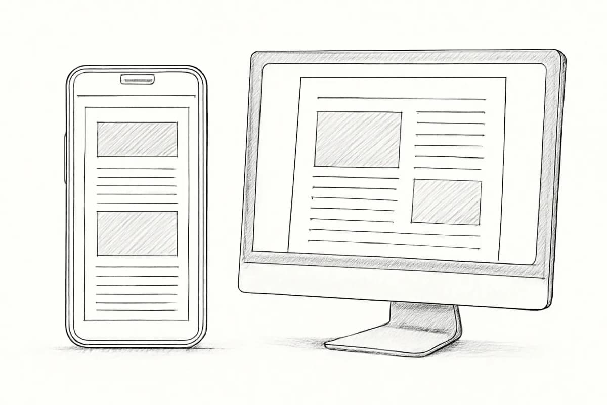
Frequently Asked Questions
What is the recommended email width for Mailchimp templates?
Mailchimp templates are designed to be no greater than 600px wide to fit the display capabilities of most email clients. While you can stretch a template wider, this is the standard that renders reliably across Gmail, Outlook, Apple Mail, and mobile clients.
Should I use single-column or multi-column layouts in Mailchimp?
It depends on your content type. A single-column layout works well for mobile device viewing and keeps the design simple, while a multi-column design can showcase multiple products or features at once. For most use cases, single-column is the safer default because it renders predictably on every screen size.
What font size should I use in Mailchimp emails for mobile?
A minimum font size of 16px is recommended for mobile. Apple recommends 17 to 22px and Google recommends 18 to 22px. Anything smaller than 16px requires users to pinch-zoom, which significantly reduces engagement.
How do I maintain brand consistency across Mailchimp email campaigns?
Save your logos, fonts, colors, and brand personality in Mailchimp's Brand Kit. The platform will use AI and those assets to quickly generate stylish, on-brand graphics and layouts for your emails, social posts, and automation flows. Pair that with a small set of reusable campaign templates and your design output will stay consistent without starting from scratch each time.