
Your marketing email template design either works for your campaign or quietly kills it. A poorly structured template, one with the wrong column layout, broken mobile rendering, or a buried call to action, loses conversions before your subscriber reads a single word. This guide covers what actually drives template performance: layout decisions, mobile standards, CTA construction, accessibility, and the testing process that ties it together.
Key Takeaways
- Mobile devices now account for 55% of all email opens globally, making mobile-first design non-negotiable for any template you build.
- Mobile-optimized emails generate 15% higher conversion rates compared to non-optimized versions.
- 99.9% of emails analyzed in the Email Markup Consortium's Accessibility Report 2024 contained "Critical" or "Serious" accessibility issues, meaning a baseline accessible template is an immediate competitive advantage.
- A 600px template width is the safe, universally compatible standard for desktop and mobile rendering.
- Single CTA buttons outperform text links and multi-CTA layouts; a 500-email A/B test showed buttons pulling 7.8% CTR versus 3.2% for text links, a 2.4x difference from one design change.
Why Template Design Has a Direct Line to ROI
Email design is not just about aesthetics. It is about delivering the right message to the right person at the right time in a way that is easy to understand and act upon.
Around 376.5 billion emails were sent and received worldwide every day in 2025. North American businesses send an average of 25.57 emails over 30 days. Yet many of these emails remain unread, unopened, marked as spam, deleted, or completely ignored.
That volume means inbox attention is scarce. Your marketing email template design determines, within the first two seconds, whether a subscriber engages or leaves. Mobile email viewing averages only 10 seconds. This compressed attention window demands immediate visual hierarchy and scannable content that communicates value instantly.
Every structural decision in your template, from column count to font size to button placement, either supports or undermines that 10-second window.
Choose Your Layout Based on Content Goal, Not Preference
The layout debate between single-column and multi-column is not really a debate. The right answer depends entirely on what your email needs to accomplish.
Single-Column: Best for Focus and Mobile Clarity
The dominance of the single-column layout is rooted in cognitive economy. When a user opens an email on a mobile device, they are rarely looking to browse. They are looking to triage. The single-column layout aligns perfectly with this behavior by enforcing a linear hierarchy.
Data from Q1 2025 shows that for text-heavy B2B communications, single-column layouts outperform multi-column variants by an average of 22% in click-through effectiveness.
This makes single-column the right default for:
- Lead nurturing sequences
- Welcome emails
- Transactional messages
- High-value B2B propositions
- Time-sensitive promotions
Multi-Column: Best for Product Selection and Catalogs
Multi-column layouts are the correct choice when the strategy shifts from "directing attention" to "offering selection." This is most common in e-commerce, media digests, and large-inventory catalogs.
Testing across high-volume retail accounts in late 2024 showed that emails featuring a 2x2 or 3x3 product grid generated 15% higher revenue per open than single-column product lists. The data suggests that when a user is in a shopping mindset, the requirement to scroll excessively acts as a deterrent. They prefer to see a "menu" of options immediately.
The practical rule: use single-column as your default, shift to multi-column only when your content type genuinely benefits from side-by-side comparison or browsing. And always test how multi-column layouts render on mobile before sending.
Dimensions and File Weight: The Technical Baseline
Before you design anything, these numbers give you a non-negotiable starting point.
Stick to 600px for a safe, universally compatible width. If you want more breathing room, test up to 700px but avoid going wider.
The "above the fold" area, roughly the first 300-500px, should grab attention with key content or a call to action. Prioritize critical information in the top 300px.
Aim for a total file size of 100KB or less for your email, including HTML, images, and code. Heavier files slow load times, which directly impacts engagement rates, with slow-loading emails facing immediate deletion on mobile devices.
For typography, choose web-safe, legible fonts and keep font sizes at a minimum of 14-16px for body text and 20-22px or more for headlines. This ensures text is readable without zooming.
Mobile-First Design: What It Actually Means
Mobile-responsive does not mean mobile-first. Many email service providers offer "responsive" templates that simply shrink desktop designs to fit smaller screens. The problem is that shrinking a three-column layout designed for a 27-inch monitor creates terrible mobile experiences.
Mobile-first means you build for the smallest screen first, then scale up for desktop. Practically, this means:
- Single-column default for content flow
- Use single-column layouts, larger fonts (16px+), and tappable buttons at least 44px in height
- Aim for a text-to-image ratio of 60:40, ensuring images take up a maximum of 40% of your email content
- Emails with three or fewer images and 20 lines of text tend to have higher click rates, highlighting the importance of simplicity
50% of consumers would rather delete an email if it is not optimized for mobile viewing. That is not a recoverable loss. It is a list engagement problem that compounds over time.
For deeper strategy on how design connects with your broader email approach, see Email Marketing Strategy Template for 2025.
Building CTAs That Actually Get Clicked
Your call to action is the only part of the email that directly produces revenue. Treat it with that level of precision.
A tested comparison showed buttons pulling 7.8% CTR versus 3.2% for text links, a 2.4x difference from a single design change. Use HTML/CSS-coded buttons, not image-based CTAs. With roughly 15-40% of recipients blocking images depending on client and settings, an image-based button can literally disappear.
For sizing, mobile-optimized emails show 30% higher click rates on the primary CTA compared to non-optimized versions. This improvement stems from proper button sizing and strategic placement for thumb navigation.
Key CTA rules:
- Minimum button size: Buttons should be at least 44 by 44 pixels. For mobile-heavy audiences, go larger.
- One primary CTA per email. Emails with a single CTA increase click-through rates by up to 371% compared to emails with multiple CTAs.
- CTA copy: Keep your CTA copy actionable and to the point. Tell subscribers exactly what you want them to do. One to five words is usually enough.
- Contrast: Maintain WCAG AA contrast at a 4.5:1 minimum. If your button text does not pass a contrast check against the button background, fix it before you send.
- Dark mode: Around 30-50% of email opens happen in dark mode, so test your CTA colors in dark mode before every campaign.
Accessibility Is a Design Standard, Not a Bonus Feature
The design and build choices that make email accessible are the same ones that make it clearer, faster, and more effective.
With 1 in 4 adults in the US and EU living with disabilities and 1.4 billion people projected to be 60 or older by 2030, accessibility in email design is no longer optional.
The key elements to build into every template:
- Write alt text that describes the purpose of the image, not every visual detail. Decorative images can use empty alt text.
- Use alternative text on images, greater focus on color contrast, and semantic HTML in email design.
- Organize your email with semantic HTML elements such as headings and lists. Use descriptive link text like "Explore our latest tips" rather than vague phrases like "Click here."
- Body text should be at least 16px.
- Use transparent images and dark mode-friendly colors to display correctly in light and dark themes. Preview your emails in dark mode to avoid unreadable text or missing visual elements.
Accessible email touches revenue, deliverability, brand trust, and legal exposure. Subscribers read email in dark mode, on small screens, with images turned off, with screen readers, and in noisy environments where they are skimming between meetings.
Brand Consistency Across Every Template
Templates are a great foundation for effective email design, but they are also an opportunity for your brand image to shine through. Change anything that is not consistent with your brand image.
Upload your brand assets and save them in a brand library. This way you can maintain the same design elements: color scheme, fonts, headings, and footers across every send.
Branding consistency in templates serves two functions. First, it builds recognition, which raises open rates over time. Second, it signals to spam filters that your sends are legitimate and predictable. Using the same language and colors helps jog a subscriber's memory about your brand or products.
For campaign-specific template inspiration in action, see Best Examples of Email Marketing That Drive Results.
Test Your Templates Before and After You Send
Creating an email template is just the first step. Ongoing optimization is essential to ensure long-term effectiveness. What works today may not work tomorrow. Regular A/B testing allows marketers to refine their strategies and maximize performance by comparing different elements and analyzing impact.
What to test systematically:
- Subject line and preheader combinations
- Email layouts (single-column vs. multi-column, image-heavy vs. minimalistic) and CTA placements (above the fold, at the bottom, or multiple locations)
- Button copy, color, and size
- Image-to-text ratio
- Personalization tokens
Metrics like open rates indicate how compelling your subject line and preheader text are, while CTR shows whether your content and CTA encourage action. Conversion rates measure how well your email drives the desired outcome. Evaluating these insights determines what resonates most with your audience.
For a complete framework on tracking what matters, see Email Marketing Analytics Best Practices. And once your templates are performing, pair them with strong subject lines using the guidance in Email Subject Line Best Practices That Boost Open Rates by 27%. 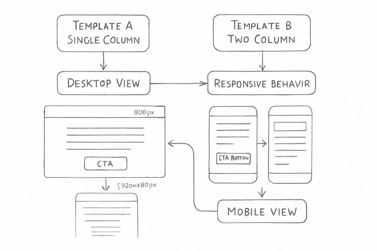
Frequently Asked Questions
What is the best width for a marketing email template?
600px is the safe, universally compatible width for email templates. If you want more breathing room, test up to 700px but avoid going wider. On mobile, aim for a 320px to 600px effective width.
Should I use a single-column or multi-column email layout?
The answer depends on your goal. For narrative-driven content, lead nurturing sequences, or high-value B2B propositions, single-column layouts are vital. Recent data shows that for text-heavy B2B communications, single-column layouts outperform multi-column variants by an average of 22% in click-through effectiveness. Multi-column works better for product catalogs and e-commerce sends where browsing behavior drives revenue.
How do I make my email CTA buttons accessible?
Buttons should be at least 44 by 44 pixels. Provide adequate spacing between links. Maintain a logical reading order in the code. Avoid tiny navigation on mobile. Additionally, maintain WCAG AA contrast at a 4.5:1 minimum ratio and always code your buttons in HTML rather than embedding them as images.
How often should I update my email template design?
Update design and copy quarterly or when engagement metrics such as CTR, open rate, and conversions decline. Track device-specific open and click data to catch rendering issues early, and test every template across major email clients before any significant campaign launch.