
Email
Email

A modern blog built with Payload CMS, Next.js, and shadcn/ui.

RSS FeedSitemap

Explore

  • Blog
  • News
  • Statistics
  • Authors

Categories

  • Hiring & Team Building
  • Email Campaign Strategy
  • Email Design & Templates
  • Email Compliance & Legal
  • Email Deliverability & Best Practices
  • Career Development
  • Email Strategy for Finance & Professional Services
  • Email Marketing Metrics

Latest articles

  • How to Hire an Email Marketing SpecialistJul 22, 2026
  • Email Marketing Campaigns Template: Ready-to-UseJul 22, 2026
  • Canva Email Marketing Templates: Design Fast, Convert MoreJul 22, 2026
  • Email Marketing Templates for FranchisesJul 22, 2026

Popular topics

  • #Specialist Skills
  • #Team Building
  • #Templates
  • #Canva
  • #Advanced Strategies
  • #multi-location businesses
  • #Marketing Regulations
  • #Lead Follow-Up
  • #iCloud Email
  • #Marketing Management
  • #Product Launch
  • #Electrician Marketing
  • #statistics
  • #Budget-Friendly
  • #Free Resources
  • #Miami businesses

Stay in the loop

Join 2,000+ readers. Unsubscribe anytime.

Subscribe
Email

© 2026 Email. All rights reserved.

SitemapRSS
HomeBlogEmail Design & PersonalizationBest Practices for Email Marketing Design
Email Design & Personalization

Best Practices for Email Marketing Design

Master email design that converts. Learn layout, typography, mobile optimization, and testing strategies to boost open rates and engagement.

S

Sarah Mitchell

May 7, 2026

10 min read
Share:
#Email Design#Email Templates#Email Workflows#Mobile-First Design
Illustration for best practices email marketing design

Stay in the loop

Get the latest posts delivered straight to your inbox. No spam, unsubscribe anytime.

Your email design is either earning attention or losing it within the first few seconds. Consumers spend an average of just 10 seconds reading brand emails, and that window shrinks further when the design is hard to read, poorly laid out, or broken on mobile. Following the right best practices for email marketing design is not a nice-to-have. It is a direct driver of opens, clicks, and revenue.

This guide covers the core design principles that affect deliverability, readability, click-through rates, and conversion, with data to back each one.

Key Takeaways

  • More than 50% of users delete an email if it does not display correctly on their phone.
  • Button-based CTAs improve click-through rates by 127% compared to text links, according to Campaign Monitor research.
  • An average of 35% of email opens tracked by Litmus used dark mode in 2022, representing steady adoption year over year.
  • Aim for a 60/40 text-to-image ratio and keep your images under 200KB to protect deliverability.
  • Emails with a single CTA generate 371% more clicks than multi-CTA emails.

Why Email Design Directly Affects Performance

Design is not decoration. Every structural and visual choice you make in an email changes how people engage with it, whether spam filters trust it, and whether your message lands at all.

Text-forward or lightly designed emails are on the rise, driven by user fatigue, inbox security, and the desire for authenticity. Today's audiences are more wary of emails that feel overly produced. Simpler designs feel more human, more trustworthy, and more like a direct message from a real person than a mass-marketing campaign.

That does not mean abandoning visual identity. It means making every design decision intentional, purposeful, and tested.

Mobile-First Design Is Non-Negotiable

Mobile devices account for 55% of all email opens globally, with some sources reporting over 80% for specific audiences. If your template is not built for small screens, you are designing for a minority.

Responsive email design adapts to different devices and screen sizes. Research from Mailchimp shows that responsive email templates get higher click rates on all devices. They are particularly effective on mobile users, where the increase in unique clicks from 2.7% to 3.1% represents a 15% increase in actual clicks.

The consequences of ignoring mobile go beyond lower engagement. Around 69% of recipients delete emails that are not optimized for mobile.

Mobile Design Checklist

  • Use a single-column layout for clean vertical scrolling
  • Keep subject lines under 30 characters, use minimum 44x44 pixel touch targets, and apply responsive design
  • Set font size at a minimum of 14px for desktop and 16px for mobile devices. Scaling up to 16px for desktop and 18px for mobile accounts for variation in font display across email clients.
  • Test across Gmail, Apple Mail, and Outlook before every send

Typography That Keeps Readers Engaged

Font choices affect more than aesthetics. They affect how long someone reads and whether they click.

Use at least a 14px font size. There is no real upper limit, but anything below 14px becomes hard for many people to read, and iOS Apple Mail's automatic text adjustment feature will kick in and enlarge your text.

For body copy, stick to web-safe, highly readable fonts. Gmail, Outlook, Apple Mail, and others handle fonts differently. Prioritize web-safe fonts such as Arial, Helvetica, Georgia, Verdana, and Tahoma, and always specify fallback options in your CSS stack.

Line spacing is equally important. Use a line height that is 1.5x or 2x your font size. Spacing between lines prevents copy from looking like a solid wall of words, but too much space between each line can make reading and scanning a challenge.

Keep your email to a maximum of two fonts: one for headings, one for body text. More than that creates visual noise without benefit.

CTA Design: The Element That Decides Revenue

Your call-to-action button is the highest-leverage design element in any email. Getting it right has a measurable effect on the bottom line.

According to Campaign Monitor research, button-based CTAs improved click-through rates by 127%. The reason is simple: buttons generally perform better than in-line links. Readers scan email copy, so you need to catch their attention quickly. While they might miss a hyperlinked section of text, buttons are more noticeable and improve click rates.

One CTA per email is a firm best practice backed by data. Emails with a single CTA generate 371% more clicks and 1,617% more sales than multi-CTA emails.

CTA Design Rules

  • Hit 44px or larger tap targets on mobile
  • Use an adequate amount of white space around your CTA button so it stands out and invites a click
  • Build buttons in HTML/CSS, never as images. Code for Outlook first using VML.
  • Use descriptive button text. "Download the Report" outperforms "Click here" because it tells readers exactly what they get

For more on writing compelling campaigns that drive action, see our guide to best examples of email marketing that drive results.

Image Usage and Text-to-Image Balance

Visuals make emails more engaging, but an image-heavy design creates real deliverability risk.

ESPs like Gmail and Yahoo have explicit filters for emails that are too image-heavy. Your email may go straight to spam.

Aim for a 60/40 text-to-image ratio and keep your images under 200KB. The practical test: remove all images from your email and read what is left. If it communicates nothing, you need more text.

Putting all your text inside an image is one of the biggest and most costly mistakes. Screen readers cannot read text embedded in an image unless you use perfect alt text for every single text element, which is impractical.

Additional image best practices:

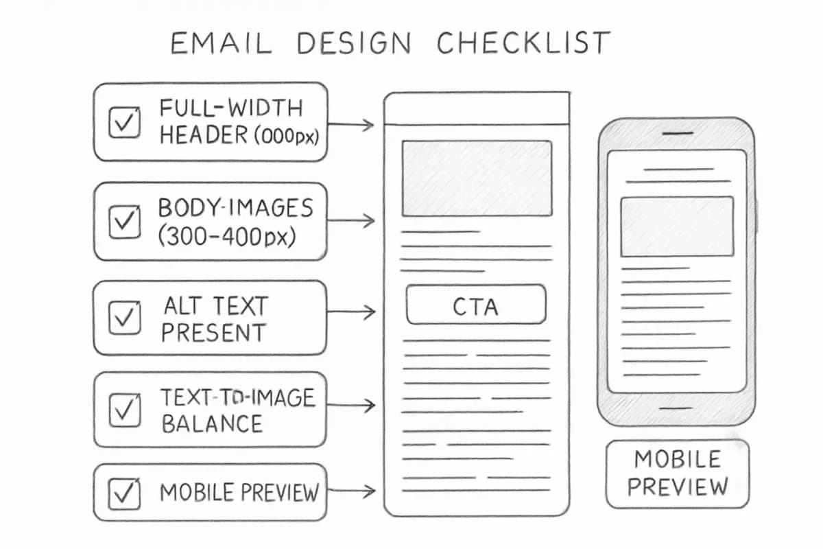
  • Full-width headers are usually best at about 600 pixels wide. In the email body, images look clean at 300 to 400 pixels wide.
  • Always write descriptive alt text on every image, both for accessibility and for subscribers who have images blocked by default Email design checklist showing key mobile optimization elements including full-width header at 600px, body images at 300-400px width, descriptive alt text field, CTA button placement, and text-to-image balance ratio. Layout should show a vertical email template with annotations pointing to each element, checkboxes indicating best practices, and mobile device frame on the right side showing how the design renders on small screens.
Dark Mode Compatibility

Dark mode is no longer niche. Over 40% of users view their emails in dark mode. Ignoring it means a significant share of your audience may be looking at broken layouts, invisible logos, and unreadable text.

Email clients handle dark mode in three ways. Yahoo Mail and Apple Mail make no changes at all. Outlook applies a partial color invert, detecting light-colored sections and turning them dark. Gmail apps perform a full invert, where everything switches. This inconsistency means you need to design and test carefully.

To design for both environments:

  • Use text wherever possible, rather than images that contain text. This allows full color inversion and is better for accessibility.
  • Follow WCAG guidelines, which recommend a minimum contrast ratio of 4.5:1 for normal text.
  • Stick to font sizes between 14 and 16px for body content and 20 to 24px for headlines.
  • Test your logo specifically. A dark logo on a white background becomes invisible in full-invert dark mode.

Use tools like Litmus or Email on Acid to preview across clients before every send.

Email Layout and Visual Hierarchy

Even strong copy fails when the layout is cluttered or hard to scan. The visual hierarchy should guide the reader naturally from the headline to the body to the CTA.

Research shows single-column layouts, short paragraphs, and high contrast backgrounds optimize reading comprehension and user engagement. Consistent, simple layouts reduce cognitive load and improve comprehension.

Use these structural principles:

  • Headline sets the context. Keep it under 60 characters.
  • Body copy delivers the one key message. One email, one idea.
  • CTA closes the loop. Make it visually dominant.
  • Footer includes legal requirements, the unsubscribe link, and your physical address

In 2025, senders are paying closer attention to accessibility best practices, including the use of alternative text on images, greater focus on color contrast, and increased adoption of semantic HTML in email design. Ensuring emails are legible in dark mode is also becoming a priority.

A clean layout also protects deliverability. HTML file size directly impacts email deliverability. When testing HTML emails ranging in size from 15KB to 650KB, files under 100KB landed in the inbox with no problems. Deliverability became an issue as file size crept above 100KB.

Test Before You Send

Design decisions only matter if they survive real inbox rendering. Only 47% of teams use rendering checks to test emails across mobile and other platforms. This means over half of email senders send emails without knowing how they appear on subscribers' devices.

Pre-send testing should cover:

  1. Rendering across at least Gmail, Apple Mail, and Outlook
  2. Dark mode preview on mobile and desktop
  3. Images-blocked view to verify the email still communicates its message
  4. CTA tap targets on mobile (minimum 44x44px)
  5. Plain-text version for email clients that do not render HTML

A well-designed email that fails rendering in the most-used email clients is wasted effort. Build testing into your workflow, not as an afterthought.

For a full pre-send process, our email marketing campaign checklist covers all 12 steps before hitting send.

Personalization and Dynamic Content in Design

Design and personalization work together. Brands that personalize promotional marketing emails experience 27% higher unique click rates and 11% higher open rates. Personalized emails deliver six times higher transactional rates.

Dynamic content blocks let you swap images, headlines, or CTA copy based on subscriber data without building separate campaigns. 65% of email marketers say dynamic content is their most effective personalization tactic.

At the design level, this means:

  • Designing modular templates with swappable content blocks
  • Leaving space for personalized hero images or product recommendations
  • Keeping layout consistent so dynamic content does not break the structure

Pair strong design with thoughtful segmentation for the biggest impact. See our guide on email list segmentation strategies that boost ROI by 760% for the full segmentation playbook.


Frequently Asked Questions

What is the best email width for marketing emails?

Most email templates are built at 600 pixels wide. This width renders correctly across the majority of email clients, including Outlook and Gmail. On mobile, a single-column responsive layout will stack content vertically. Full-width headers are typically best at about 600 pixels wide.

How many images should a marketing email include?

There is no fixed maximum, but balance matters. Each email should contain about 60% text and 40% images. This ratio keeps messages readable while lowering spam risk. Readers get context from text, while images draw attention and reinforce the message. Always include alt text and avoid embedding your key message or CTA inside an image.

Does email design affect deliverability?

Yes, in several ways. Image-heavy emails with minimal text can trigger spam filters. One of the red flags for spam filters is an email that is image-heavy with very little text. If your email is just one big image, it is highly likely to be flagged as spam or sent directly to the Promotions or Junk folder. HTML file size, link count, and engagement signals also feed into inbox placement.

How often should I test my email design?

Before every send. Rendering environments change as email clients update their code. Email testing platforms like Litmus and Email on Acid recommend testing across at least 15 different email clients and devices. Build a pre-send checklist that includes rendering tests, dark mode preview, and a mobile tap-target check as standard steps.


No comments yet. Be the first!

Leave a comment

Comments are reviewed before publishing.

More from

Related posts

Illustration for bulk ai avatar generation for email marketing
Email Design & PersonalizationJul 16, 2026 12 min

Bulk AI Avatar Generation for Email Marketing

Generate personalized AI avatars at scale for email campaigns. Learn how bulk avatar creation boosts engagement and improves deliverability.

RRachel Torres
Illustration for ai in email marketing personalization
Email Design & PersonalizationJul 16, 2026 10 min

AI in Email Marketing Personalization: A Complete Guide

Learn how AI personalizes email campaigns to boost engagement and ROI. Discover practical strategies, tools, and real results from data-driven experts.

PPriya Kapoor
Illustration for marketing email templates design
Email Design & PersonalizationMay 17, 2026 11 min

Marketing Email Templates Design Guide

Learn how to design email templates that convert. Best practices for layout, copywriting, and mobile optimization to boost your email marketing ROI.

JJames Chen
HomeBlogEmail Design & PersonalizationBest Practices for Email Marketing Design
Email Design & Personalization

Best Practices for Email Marketing Design

Master email design that converts. Learn layout, typography, mobile optimization, and testing strategies to boost open rates and engagement.

S

Sarah Mitchell

May 7, 2026

10 min read
Share:
#Email Design#Email Templates#Email Workflows#Mobile-First Design
Illustration for best practices email marketing design

Stay in the loop

Get the latest posts delivered straight to your inbox. No spam, unsubscribe anytime.

Your email design is either earning attention or losing it within the first few seconds. Consumers spend an average of just 10 seconds reading brand emails, and that window shrinks further when the design is hard to read, poorly laid out, or broken on mobile. Following the right best practices for email marketing design is not a nice-to-have. It is a direct driver of opens, clicks, and revenue.

This guide covers the core design principles that affect deliverability, readability, click-through rates, and conversion, with data to back each one.

Key Takeaways

  • More than 50% of users delete an email if it does not display correctly on their phone.
  • Button-based CTAs improve click-through rates by 127% compared to text links, according to Campaign Monitor research.
  • An average of 35% of email opens tracked by Litmus used dark mode in 2022, representing steady adoption year over year.
  • Aim for a 60/40 text-to-image ratio and keep your images under 200KB to protect deliverability.
  • Emails with a single CTA generate 371% more clicks than multi-CTA emails.

Why Email Design Directly Affects Performance

Design is not decoration. Every structural and visual choice you make in an email changes how people engage with it, whether spam filters trust it, and whether your message lands at all.

Text-forward or lightly designed emails are on the rise, driven by user fatigue, inbox security, and the desire for authenticity. Today's audiences are more wary of emails that feel overly produced. Simpler designs feel more human, more trustworthy, and more like a direct message from a real person than a mass-marketing campaign.

That does not mean abandoning visual identity. It means making every design decision intentional, purposeful, and tested.

Mobile-First Design Is Non-Negotiable

Mobile devices account for 55% of all email opens globally, with some sources reporting over 80% for specific audiences. If your template is not built for small screens, you are designing for a minority.

Responsive email design adapts to different devices and screen sizes. Research from Mailchimp shows that responsive email templates get higher click rates on all devices. They are particularly effective on mobile users, where the increase in unique clicks from 2.7% to 3.1% represents a 15% increase in actual clicks.

The consequences of ignoring mobile go beyond lower engagement. Around 69% of recipients delete emails that are not optimized for mobile.

Mobile Design Checklist

  • Use a single-column layout for clean vertical scrolling
  • Keep subject lines under 30 characters, use minimum 44x44 pixel touch targets, and apply responsive design
  • Set font size at a minimum of 14px for desktop and 16px for mobile devices. Scaling up to 16px for desktop and 18px for mobile accounts for variation in font display across email clients.
  • Test across Gmail, Apple Mail, and Outlook before every send

Typography That Keeps Readers Engaged

Font choices affect more than aesthetics. They affect how long someone reads and whether they click.

Use at least a 14px font size. There is no real upper limit, but anything below 14px becomes hard for many people to read, and iOS Apple Mail's automatic text adjustment feature will kick in and enlarge your text.

For body copy, stick to web-safe, highly readable fonts. Gmail, Outlook, Apple Mail, and others handle fonts differently. Prioritize web-safe fonts such as Arial, Helvetica, Georgia, Verdana, and Tahoma, and always specify fallback options in your CSS stack.

Line spacing is equally important. Use a line height that is 1.5x or 2x your font size. Spacing between lines prevents copy from looking like a solid wall of words, but too much space between each line can make reading and scanning a challenge.

Keep your email to a maximum of two fonts: one for headings, one for body text. More than that creates visual noise without benefit.

CTA Design: The Element That Decides Revenue

Your call-to-action button is the highest-leverage design element in any email. Getting it right has a measurable effect on the bottom line.

According to Campaign Monitor research, button-based CTAs improved click-through rates by 127%. The reason is simple: buttons generally perform better than in-line links. Readers scan email copy, so you need to catch their attention quickly. While they might miss a hyperlinked section of text, buttons are more noticeable and improve click rates.

One CTA per email is a firm best practice backed by data. Emails with a single CTA generate 371% more clicks and 1,617% more sales than multi-CTA emails.

CTA Design Rules

  • Hit 44px or larger tap targets on mobile
  • Use an adequate amount of white space around your CTA button so it stands out and invites a click
  • Build buttons in HTML/CSS, never as images. Code for Outlook first using VML.
  • Use descriptive button text. "Download the Report" outperforms "Click here" because it tells readers exactly what they get

For more on writing compelling campaigns that drive action, see our guide to best examples of email marketing that drive results.

Image Usage and Text-to-Image Balance

Visuals make emails more engaging, but an image-heavy design creates real deliverability risk.

ESPs like Gmail and Yahoo have explicit filters for emails that are too image-heavy. Your email may go straight to spam.

Aim for a 60/40 text-to-image ratio and keep your images under 200KB. The practical test: remove all images from your email and read what is left. If it communicates nothing, you need more text.

Putting all your text inside an image is one of the biggest and most costly mistakes. Screen readers cannot read text embedded in an image unless you use perfect alt text for every single text element, which is impractical.

Additional image best practices:

  • Full-width headers are usually best at about 600 pixels wide. In the email body, images look clean at 300 to 400 pixels wide.
  • Always write descriptive alt text on every image, both for accessibility and for subscribers who have images blocked by default Email design checklist showing key mobile optimization elements including full-width header at 600px, body images at 300-400px width, descriptive alt text field, CTA button placement, and text-to-image balance ratio. Layout should show a vertical email template with annotations pointing to each element, checkboxes indicating best practices, and mobile device frame on the right side showing how the design renders on small screens.

Dark Mode Compatibility

Dark mode is no longer niche. Over 40% of users view their emails in dark mode. Ignoring it means a significant share of your audience may be looking at broken layouts, invisible logos, and unreadable text.

Email clients handle dark mode in three ways. Yahoo Mail and Apple Mail make no changes at all. Outlook applies a partial color invert, detecting light-colored sections and turning them dark. Gmail apps perform a full invert, where everything switches. This inconsistency means you need to design and test carefully.

To design for both environments:

  • Use text wherever possible, rather than images that contain text. This allows full color inversion and is better for accessibility.
  • Follow WCAG guidelines, which recommend a minimum contrast ratio of 4.5:1 for normal text.
  • Stick to font sizes between 14 and 16px for body content and 20 to 24px for headlines.
  • Test your logo specifically. A dark logo on a white background becomes invisible in full-invert dark mode.

Use tools like Litmus or Email on Acid to preview across clients before every send.

Email Layout and Visual Hierarchy

Even strong copy fails when the layout is cluttered or hard to scan. The visual hierarchy should guide the reader naturally from the headline to the body to the CTA.

Research shows single-column layouts, short paragraphs, and high contrast backgrounds optimize reading comprehension and user engagement. Consistent, simple layouts reduce cognitive load and improve comprehension.

Use these structural principles:

  • Headline sets the context. Keep it under 60 characters.
  • Body copy delivers the one key message. One email, one idea.
  • CTA closes the loop. Make it visually dominant.
  • Footer includes legal requirements, the unsubscribe link, and your physical address

In 2025, senders are paying closer attention to accessibility best practices, including the use of alternative text on images, greater focus on color contrast, and increased adoption of semantic HTML in email design. Ensuring emails are legible in dark mode is also becoming a priority.

A clean layout also protects deliverability. HTML file size directly impacts email deliverability. When testing HTML emails ranging in size from 15KB to 650KB, files under 100KB landed in the inbox with no problems. Deliverability became an issue as file size crept above 100KB.

Test Before You Send

Design decisions only matter if they survive real inbox rendering. Only 47% of teams use rendering checks to test emails across mobile and other platforms. This means over half of email senders send emails without knowing how they appear on subscribers' devices.

Pre-send testing should cover:

  1. Rendering across at least Gmail, Apple Mail, and Outlook
  2. Dark mode preview on mobile and desktop
  3. Images-blocked view to verify the email still communicates its message
  4. CTA tap targets on mobile (minimum 44x44px)
  5. Plain-text version for email clients that do not render HTML

A well-designed email that fails rendering in the most-used email clients is wasted effort. Build testing into your workflow, not as an afterthought.

For a full pre-send process, our email marketing campaign checklist covers all 12 steps before hitting send.

Personalization and Dynamic Content in Design

Design and personalization work together. Brands that personalize promotional marketing emails experience 27% higher unique click rates and 11% higher open rates. Personalized emails deliver six times higher transactional rates.

Dynamic content blocks let you swap images, headlines, or CTA copy based on subscriber data without building separate campaigns. 65% of email marketers say dynamic content is their most effective personalization tactic.

At the design level, this means:

  • Designing modular templates with swappable content blocks
  • Leaving space for personalized hero images or product recommendations
  • Keeping layout consistent so dynamic content does not break the structure

Pair strong design with thoughtful segmentation for the biggest impact. See our guide on email list segmentation strategies that boost ROI by 760% for the full segmentation playbook.


Frequently Asked Questions

What is the best email width for marketing emails?

Most email templates are built at 600 pixels wide. This width renders correctly across the majority of email clients, including Outlook and Gmail. On mobile, a single-column responsive layout will stack content vertically. Full-width headers are typically best at about 600 pixels wide.

How many images should a marketing email include?

There is no fixed maximum, but balance matters. Each email should contain about 60% text and 40% images. This ratio keeps messages readable while lowering spam risk. Readers get context from text, while images draw attention and reinforce the message. Always include alt text and avoid embedding your key message or CTA inside an image.

Does email design affect deliverability?

Yes, in several ways. Image-heavy emails with minimal text can trigger spam filters. One of the red flags for spam filters is an email that is image-heavy with very little text. If your email is just one big image, it is highly likely to be flagged as spam or sent directly to the Promotions or Junk folder. HTML file size, link count, and engagement signals also feed into inbox placement.

How often should I test my email design?

Before every send. Rendering environments change as email clients update their code. Email testing platforms like Litmus and Email on Acid recommend testing across at least 15 different email clients and devices. Build a pre-send checklist that includes rendering tests, dark mode preview, and a mobile tap-target check as standard steps.

No comments yet. Be the first!

Leave a comment

Comments are reviewed before publishing.

More from

Related posts

Illustration for bulk ai avatar generation for email marketing
Email Design & PersonalizationJul 16, 2026 12 min

Bulk AI Avatar Generation for Email Marketing

Generate personalized AI avatars at scale for email campaigns. Learn how bulk avatar creation boosts engagement and improves deliverability.

RRachel Torres
Illustration for ai in email marketing personalization
Email Design & PersonalizationJul 16, 2026 10 min

AI in Email Marketing Personalization: A Complete Guide

Learn how AI personalizes email campaigns to boost engagement and ROI. Discover practical strategies, tools, and real results from data-driven experts.

PPriya Kapoor
Illustration for marketing email templates design
Email Design & PersonalizationMay 17, 2026 11 min

Marketing Email Templates Design Guide

Learn how to design email templates that convert. Best practices for layout, copywriting, and mobile optimization to boost your email marketing ROI.

JJames Chen